Colorful Alphabet
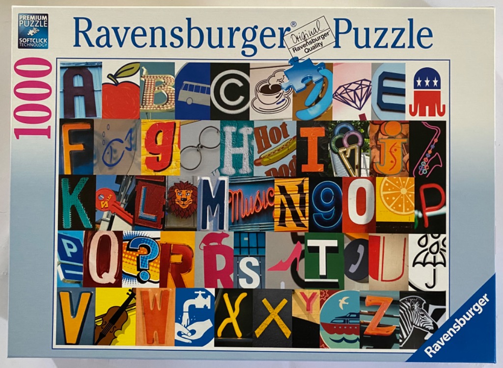
This visual collection presents the alphabet as a series of 26 individual photographic tiles arranged in a structured grid. Each tile corresponds to a letter, cleverly represented by objects, textures, or shapes found in the real world. For example, 'A' appears as a large bold letter, 'B' is depicted by a red apple, 'C' by a circular logo, 'D' by a coffee cup, and 'F' by a fish line drawing, demonstrating the whimsical and inventive nature of the imagery.
The composition is orderly and vibrant, with each square contributing to a diverse palette of colors and styles. Some tiles show neon signage, while others feature illustrations, classic typography, or photographs of everyday items like a hot dog for 'H', a pair of glasses for 'G', or a zebra for 'Z'. The varying artistic styles—ranging from street photography and graphic design to classic print—create a dynamic rhythm across the grid.
The overall aesthetic is a playful exploration of visual language, turning the alphabet into a scavenger hunt of shapes. Because the individual letters are sourced from different contexts, the lighting, perspective, and background textures change from one square to the next, giving the entire piece a busy, eclectic feel. The collage successfully integrates typography with object-based imagery to form a complete and engaging set from A to Z.

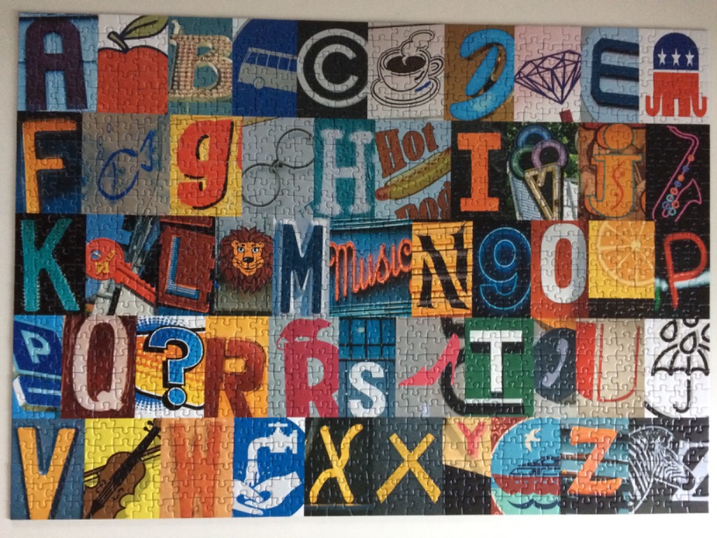
This image is a vibrant grid-based alphabet collage, organized into five rows containing panels that feature each letter from A to Z. Each panel combines a prominent letter with a visual representation or texture associated with its form. The artwork is presented as a series of square tiles, creating a structured, mosaic-like appearance that celebrates both typography and iconography.
Specific panels include iconic symbols and objects such as a red apple for A, a hot dog for H, a lion for M, a saxophone for J, a violin for V, and a zebra for Z. Some tiles feature stylized signs, like the neon-style "Music" script for M or a "Hot Dog" sign for H, while others use geometric patterns or thematic imagery, such as a coffee cup for C, a diamond for D, and an umbrella for U. The layout is systematic, reading left to right and top to bottom, filling the entire rectangular space.
The colour palette is exceptionally diverse, incorporating a full spectrum of bright primaries alongside deeper, muted tones to give each letter a unique identity. The lighting is uniform across the entire grid, suggesting a flat graphic illustration style. The composition relies on the interplay between the clean, bold lines of the letters and the detailed, colourful illustrations layered behind or around them, resulting in a lively, educational, and visually stimulating display.