50 Years of Rainbow
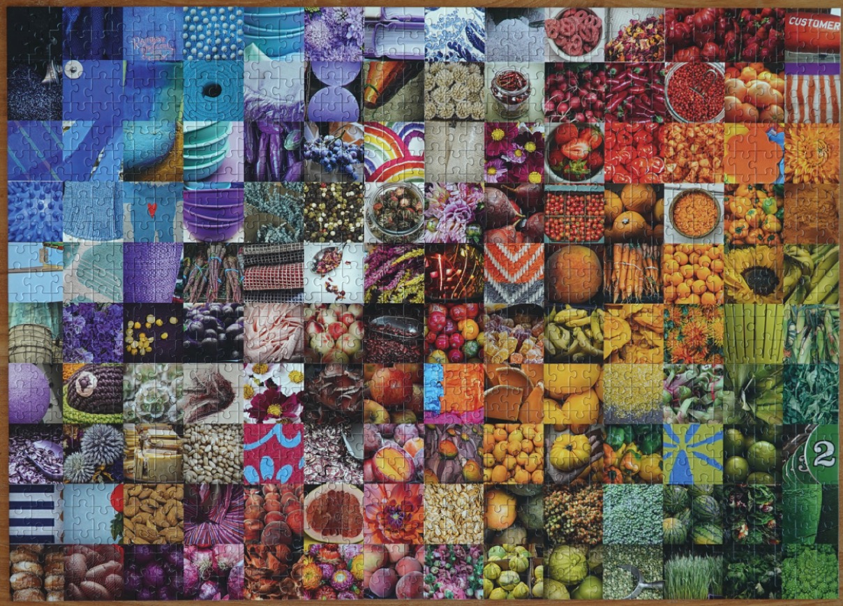
This image is a large-scale grid composed of many individual, square-shaped photographs arranged to create a seamless rainbow spectrum. The colors transition horizontally and vertically from deep blues and purples on the left side, moving through vibrant reds and oranges in the center, and shifting toward bright yellows and deep greens on the right side. Each square features a unique, high-detail macro shot of various textures and objects, including culinary items, nature, and everyday artifacts.
The content within the squares is eclectic and diverse. Featured items include heaps of red cherries, bright orange pumpkins, ripe peaches, golden sunflowers, bundles of fresh green herbs, piles of textured grains, and various patterned fabrics or objects. Some squares showcase specific, recognizable items like slices of citrus fruit, bowls of spices, or abstract geometric patterns, while others highlight organic textures like berry clusters or leafy greens. The variety provides a sense of abundance and natural complexity.
Lighting and composition vary significantly from square to square, contributing to the overall mosaic effect. The colors are highly saturated, enhancing the visual impact of the spectrum. The entire arrangement functions as an organized catalog of hues and textures, with each small square acting as a singular piece of a much larger, rainbow-colored gradient that spans the entire field of vision.
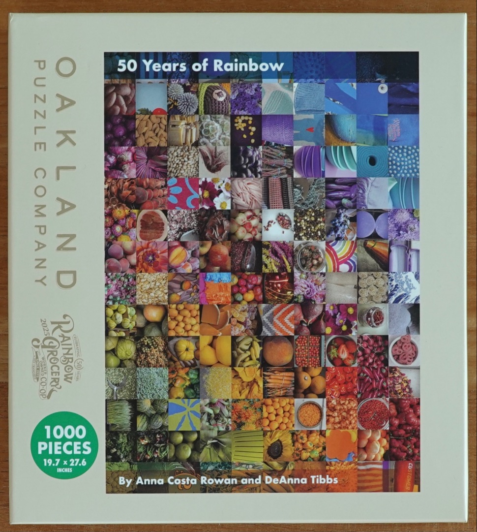
The main artwork is a dense, rectangular collage composed of numerous small, square photographs. Each square depicts a different food item, ingredient, or organic texture, such as various fruits, vegetables, grains, flowers, and culinary supplies. These squares are arranged into a systematic, flowing gradient that transitions through the entire rainbow, starting with cool blues and deep purples at the top, moving through greens and yellows in the middle, and ending with vibrant oranges and deep reds at the bottom.
The composition is highly structured, creating a grid-like visual experience that emphasizes texture and colour. Some squares feature close-up shots of single items, such as strawberries or sunflowers, while others show collections of seeds, nuts, or layered textiles. The arrangement creates a cohesive spectrum, with the hues shifting seamlessly from one square to the next, giving the impression of a vibrant, living mosaic of natural produce.
The overall mood is bright, fresh, and celebratory, highlighting the diversity and richness of food. The lighting varies per individual square to suit the specific object being depicted, ranging from soft, natural daylight on leafy produce to warmer, saturated tones on ripening fruits and vibrant spices. The style is that of a photographic compilation, showcasing a wide array of colours and organic shapes that collectively form a unified, prismatic display.
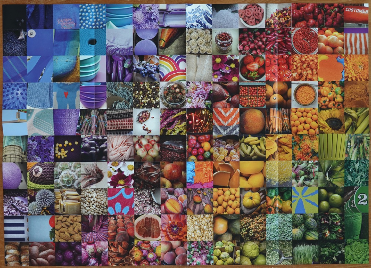
This composition is a large, ordered grid containing 144 square images arranged in a twelve-by-twelve layout. The images transition systematically through the color spectrum, beginning in the top-left corner with cool shades of deep blue, violet, and indigo. As the grid moves toward the right and downward, the colors warm significantly, shifting through vibrant purples, deep reds, bright oranges, and eventually landing on sunny yellows, earthy browns, and finally deep, verdant greens in the bottom-right corner.
The subject matter within the individual squares is highly eclectic, focusing primarily on natural textures, food, and household items. Featured items include heaps of berries, sliced fruits, fresh produce like peppers and radishes, nuts, dried spices, woven fabrics, textured vegetables, and floral patterns. Some squares highlight abstract textures like knitted wool or geometric patterns, while others display everyday objects such as bowls, fabric scraps, or kitchen accessories.
The overall mood is energetic and highly organized, emphasizing the visual harmony created by color-coordination. The lighting across the various images is generally bright and clear, highlighting the natural colors and intricate details of the textures. Each square acts as a individual visual note, contributing to an expansive, mosaic-like study of color and form that invites the viewer to scan from one hue to the next.
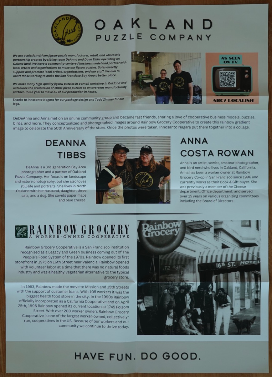
The composition is an organized, grid-like informational layout printed on paper that has been folded into quarters. The top section introduces the subject with a logo and descriptive text, accompanied by a candid photograph of a smiling man and woman standing in a workspace. A smaller, graphic-style inset features a retro television illustration with a QR code, highlighting media visibility.
The middle section shifts focus to the individual contributors, DeAnna Tibbs and Anna Costa Rowan. Two portraits of the women are included, one showing them smiling while wearing matching black t-shirts and baseball caps, providing a personal connection to the collaborative effort behind the depicted project. Descriptive paragraphs detail their backgrounds and professional roles.
The bottom section centers on the historical and institutional history of a worker-owned grocery cooperative. A black-and-white archival photograph shows a group of people standing outside a historic building with the business name visible on signage. The surrounding text provides an historical timeline of the establishment's growth, from its inception in the 1970s to its current iteration. The page concludes with the bold, centered slogan, "HAVE FUN. DO GOOD."
Throughout the document, the visual hierarchy is maintained through a combination of professional photography, historical imagery, and cleanly aligned text blocks. The color palette is understated, focusing on black text against a light cream or off-white background, creating a professional and community-focused aesthetic.
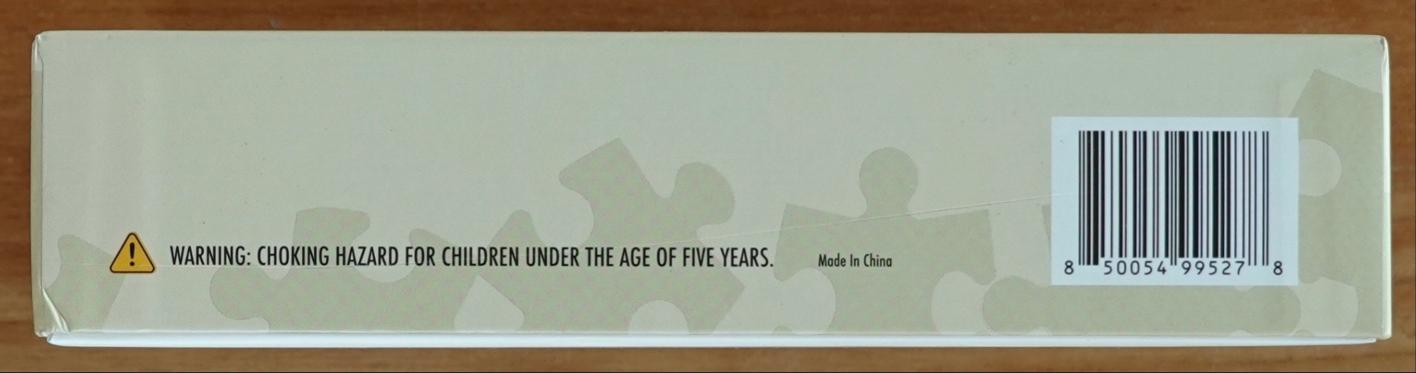
The image features a pale, monochromatic beige surface decorated with a subtle, repeating pattern of interlocking jigsaw puzzle piece silhouettes. The silhouettes are slightly lighter than the background, creating a soft, textural effect across the length of the rectangular field.
On the left side, there is a yellow warning triangle containing an exclamation point, followed by the text "WARNING: CHOKING HAZARD FOR CHILDREN UNDER THE AGE OF FIVE YEARS." Centered slightly to the right is the small, plain-text label "Made In China." A prominent barcode occupies the right-hand side, enclosed in a rectangular white frame, featuring the numbers "8 50054 99527 8" underneath the vertical black bars.
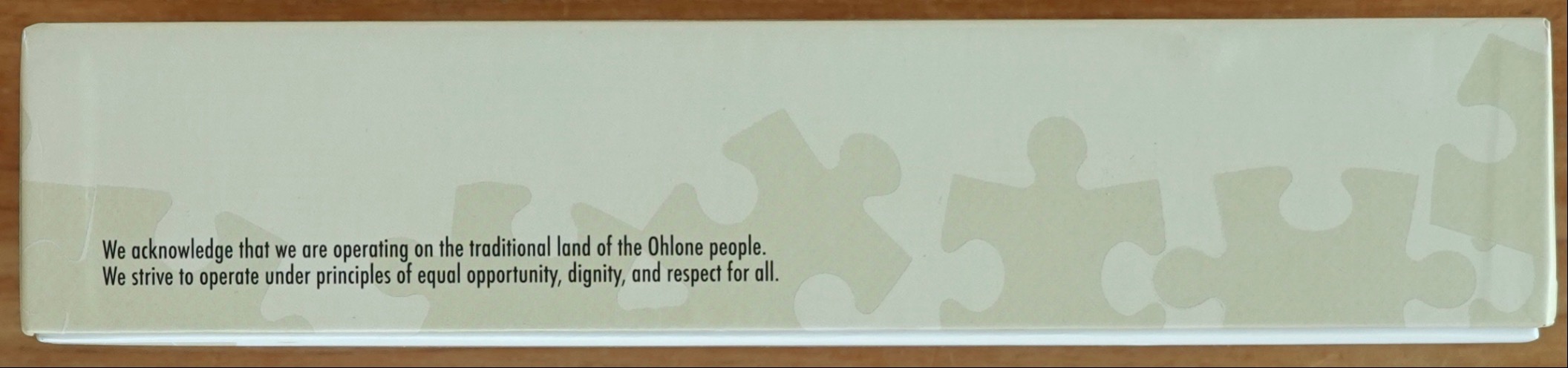
The image displays a flat, rectangular surface featuring a pale, muted olive-green background. Across the bottom right portion of the field, several ghosted, semi-transparent jigsaw puzzle piece shapes are scattered, partially overlapping and receding into the background colour. These shapes provide a subtle, monochromatic texture to the overall composition.
Positioned in the lower-left corner is a clear, dark-toned, sans-serif text block. It reads: "We acknowledge that we are operating on the traditional land of the Ohlone people. We strive to operate under principles of equal opportunity, dignity, and respect for all." The alignment is justified to the left, creating a stark contrast against the light-coloured background and providing the central focus of the image.
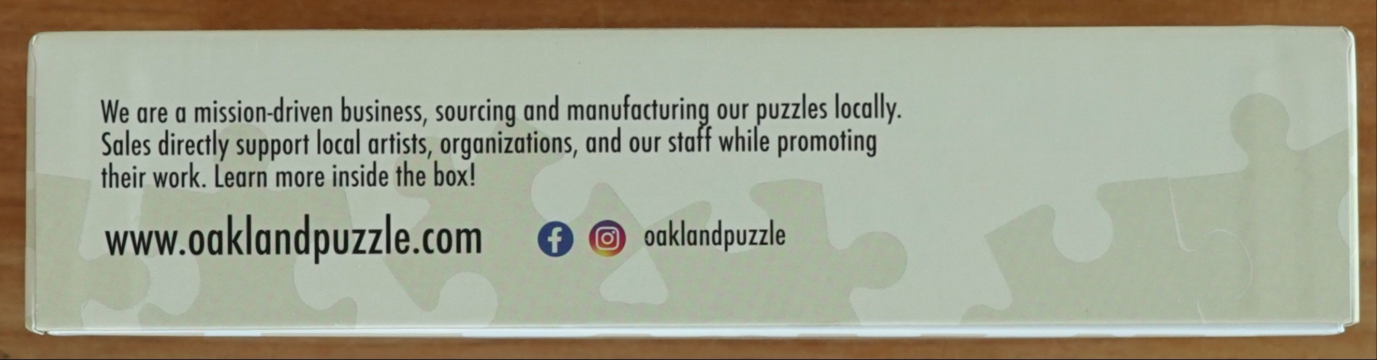
The background is a solid, light, olive-green shade, decorated with a subtle, repeating pattern of faint, light-gray jigsaw piece silhouettes that appear ghosted against the surface. The overall color palette is monochromatic and muted, creating a soft, professional appearance.
Text is centered in the upper left, stating, "We are a mission-driven business, sourcing and manufacturing our puzzles locally. Sales directly support local artists, organizations, and our staff while promoting their work. Learn more inside the box!" Below this, the bottom left displays a website address, followed by Facebook and Instagram social media icons, and the handle "oaklandpuzzle" in dark, sans-serif font.

The scene is presented on a pale, off-white background subtly embossed with large puzzle piece outlines. On the far left, a circular logo depicts a pointing finger extending downward toward a small cluster of dark puzzle pieces, enclosed by circular text. To the right of the logo, the words "HAVE FUN. DO GOOD." are printed in a bold, dark brown sans-serif font.
On the far right side, there is a rectangular photographic collage composed of numerous smaller squares. This grid showcases a vibrant spectrum of produce, including fruits and vegetables arranged by color. The progression starts with vivid greens, moving through yellows, oranges, and deep reds, before transitioning into shades of purple, blue, and violet. Each small square represents a different texture and hue of food, creating a rich, rainbow-colored mosaic effect that contrasts sharply with the minimalist, light-toned background.
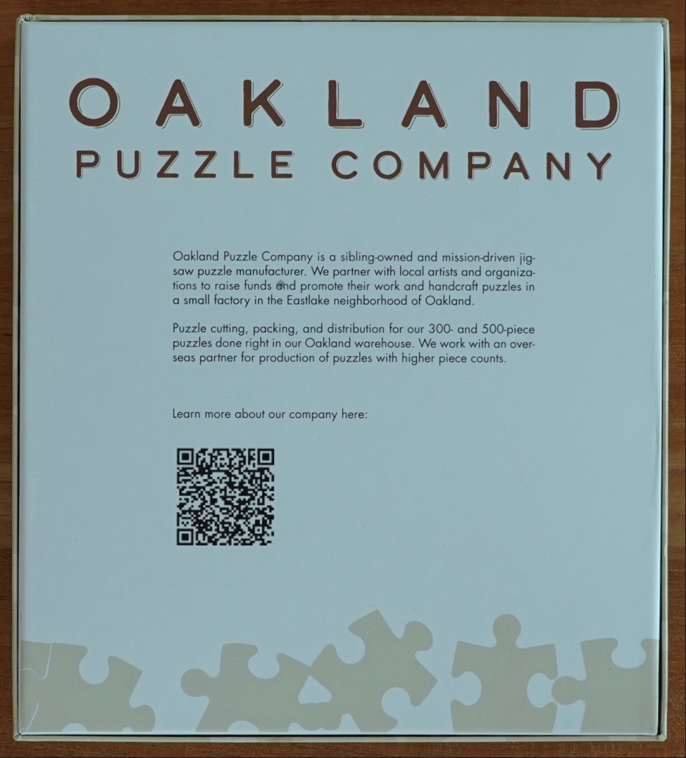
The image features a clean, minimalist graphic design on a pale, cool-toned blue background. At the top, the text "OAKLAND PUZZLE COMPANY" is printed in a dark brown, sans-serif font with a subtle drop shadow effect.
Centered below the title are two paragraphs of text explaining the company's background, mission, and manufacturing process. Below this descriptive text is a small prompt followed by a prominent black-and-white QR code positioned in the lower-left quadrant.
Along the very bottom edge of the frame, there is a decorative border consisting of flat, monochromatic beige shapes mimicking the outline of several jigsaw puzzle pieces. The overall aesthetic is professional, informative, and simple, using high-contrast dark text against a light, neutral backdrop to ensure readability.