Dad Jokes
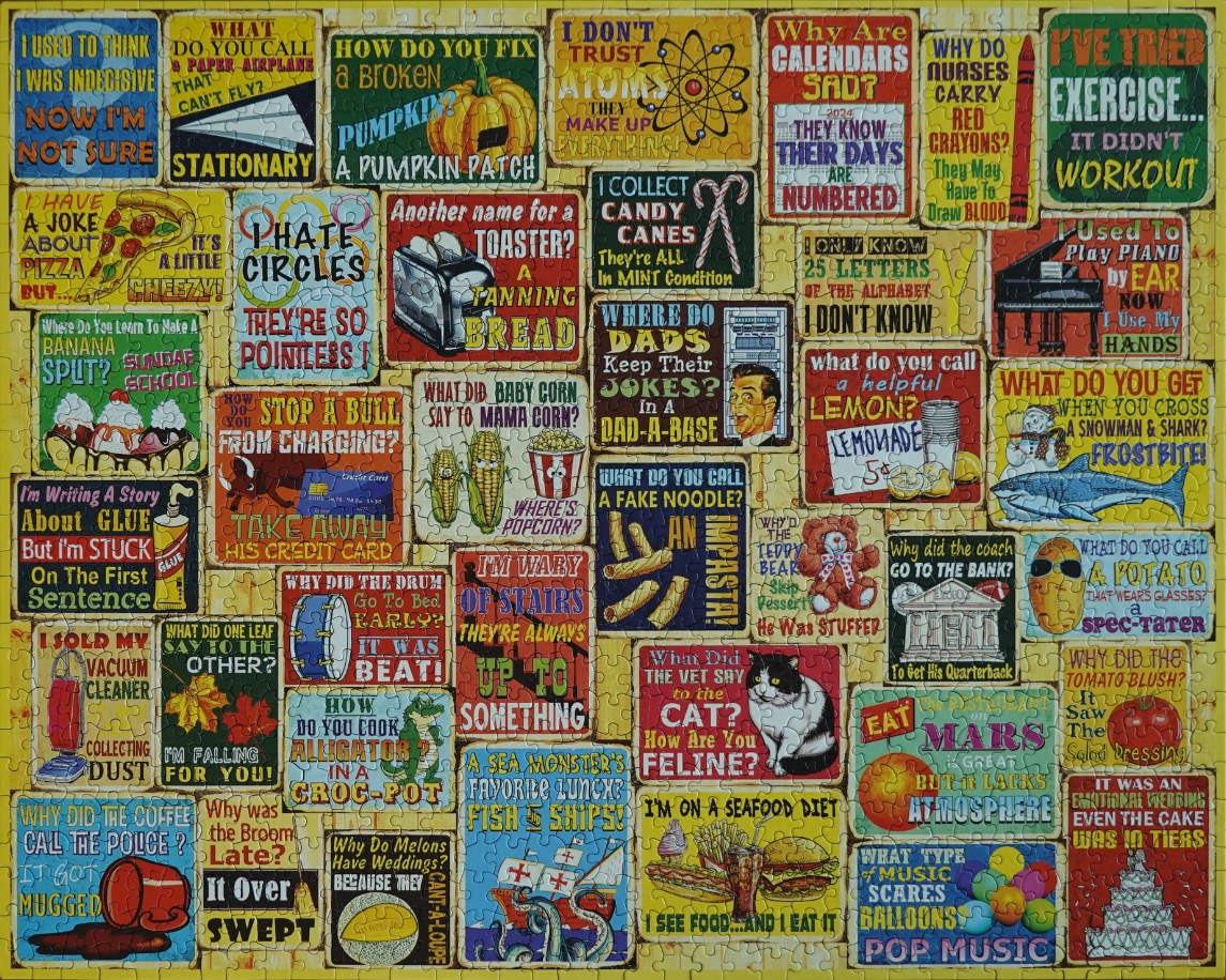
This collection features a grid of individual, rectangular graphic designs, each showcasing a humorous pun or play on words paired with a related illustration. The subjects cover a wide variety of themes, including animals, food, everyday objects, and science-related quips. Each graphic acts as a standalone card, with distinct lettering and thematic artwork that ranges from a cat and a teddy bear to a grand piano and a banana split.
The overall composition is a dense, colourful mosaic where the signs are arranged in a roughly interlocking pattern. Each sign has a weathered or vintage aesthetic, often featuring a textured appearance or faux-distressed edges that give the collection the feel of old-fashioned advertisements or retro posters. The layout is balanced, with smaller and larger rectangles creating a visually busy but structured display.
Technically, the style is reminiscent of graphic illustration or digital art designed to look like vintage signage. The colour palette is vibrant and varied, utilizing a wide spectrum of hues—from deep blues and fiery reds to cheerful yellows and earthy greens—ensuring that each individual joke stands out clearly from its neighbors. The lighting is bright and even, highlighting the diverse typography and the whimsical nature of the hand-drawn-style illustrations.
This illustration features a dense collage of rectangular signs, each showcasing a humorous dad joke accompanied by a relevant graphic. The background is a warm, light-yellow wooden plank pattern that provides a rustic texture behind the collection of signs. The overall composition is chaotic yet organized, filling the entire space with vibrant text and whimsical imagery that leans into a nostalgic, retro aesthetic.
Each sign uses a unique combination of typography, ranging from bold, blocky lettering to playful scripts, often utilizing a variety of colors to highlight punchlines. The illustrations are rendered in a charming, slightly cartoonish style. Examples include a slice of pizza for a cheesy joke, a dancing pumpkin, a grand piano, a shark, a teddy bear, and a cat, all adding visual variety to the verbal humor. The color palette is rich and varied, incorporating deep reds, blues, greens, and warm yellows, giving the entire piece a cheerful and lighthearted mood.
Technically, the image serves as an artistic compilation of puns. The style mimics vintage tin advertisements, with distressed edges and slightly muted saturation that suggests age. The contrast between the simple, often silly textual humor and the structured, colorful graphical layout makes the image feel like a wall of curated wall art. Every inch is occupied by a different joke, ensuring that the viewer's eye is constantly darting between the clever wordplay and the accompanying retro-styled depictions.
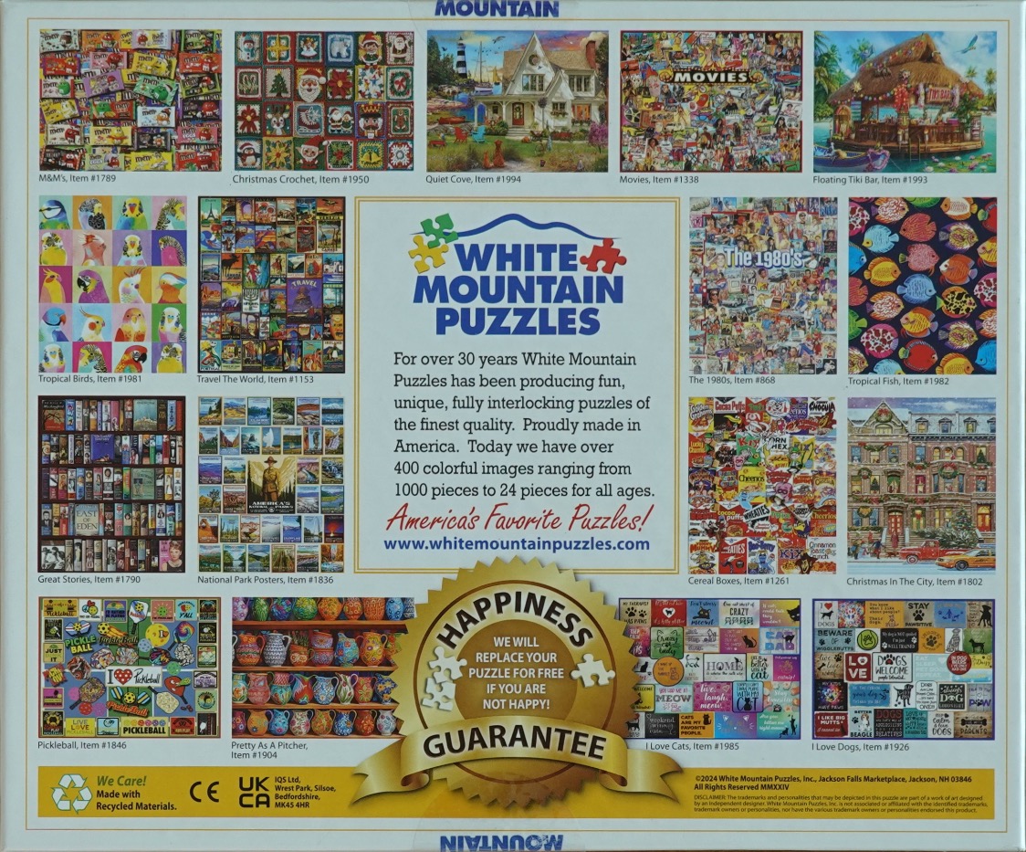
This image displays a grid arrangement of fourteen distinct puzzle designs surrounding a central text block. The subjects are varied and include a pile of colorful chocolate candy wrappers, a Christmas-themed crochet pattern, a cozy lighthouse cottage, a movie-themed montage, a floating tiki bar, and a grid of colorful tropical birds. Other images feature vintage travel posters, a shelf of classic books, a collection of national park posters, a collage of 1980s pop culture, a variety of colorful tropical fish, a display of breakfast cereal boxes, a festive city street in winter, a pickleball-themed collection, hand-painted ceramic pitchers, and collections of inspirational quotes about cats and dogs.
The layout is structured and symmetrical, with the individual puzzle artworks serving as rectangular tiles. The color palette across the entire image is highly saturated and diverse, with each tile providing a different dominant hue—ranging from the bright greens and reds of holiday themes to the soft pastels of the bird portraits and the deep tones of the bookshelf. The center of the composition features a white rectangular block containing informational text, situated above a prominent gold-colored seal promoting a customer satisfaction guarantee.
The overall aesthetic is that of a catalog or promotional display. Each image is accompanied by a small text label indicating the theme of the artwork. The style varies per tile, alternating between photographic representations, detailed illustrations, and graphic design patterns, creating a dense and visually rich mosaic of various artistic styles.
The central artwork consists of a dense, multi-panel collage featuring a variety of classic, humorous 'dad jokes.' Each joke is presented within its own rectangular frame, creating a grid-like composition that covers the majority of the available space. The text is bold and easy to read, frequently accompanied by simple, playful illustrations or icons that correspond to the punchline or the subject of the joke, such as food, animals, and household objects.
The colour palette is intentionally bright and varied to make each individual panel pop against the others. Background colours for the jokes shift between shades of yellow, blue, white, green, and red, providing a vibrant and lighthearted visual rhythm. The overall layout is structured yet whimsical, mimicking the appearance of a collection of vintage signs, note cards, or magazine cutouts.
This is an illustrative graphic design piece that focuses on humor and typography. The presentation is flat and clear, avoiding complex shading or photographic realism in favor of high-contrast, colorful graphics. The aesthetic leans into a classic, retro comic or souvenir style, emphasizing readability and quick engagement with the humorous content.

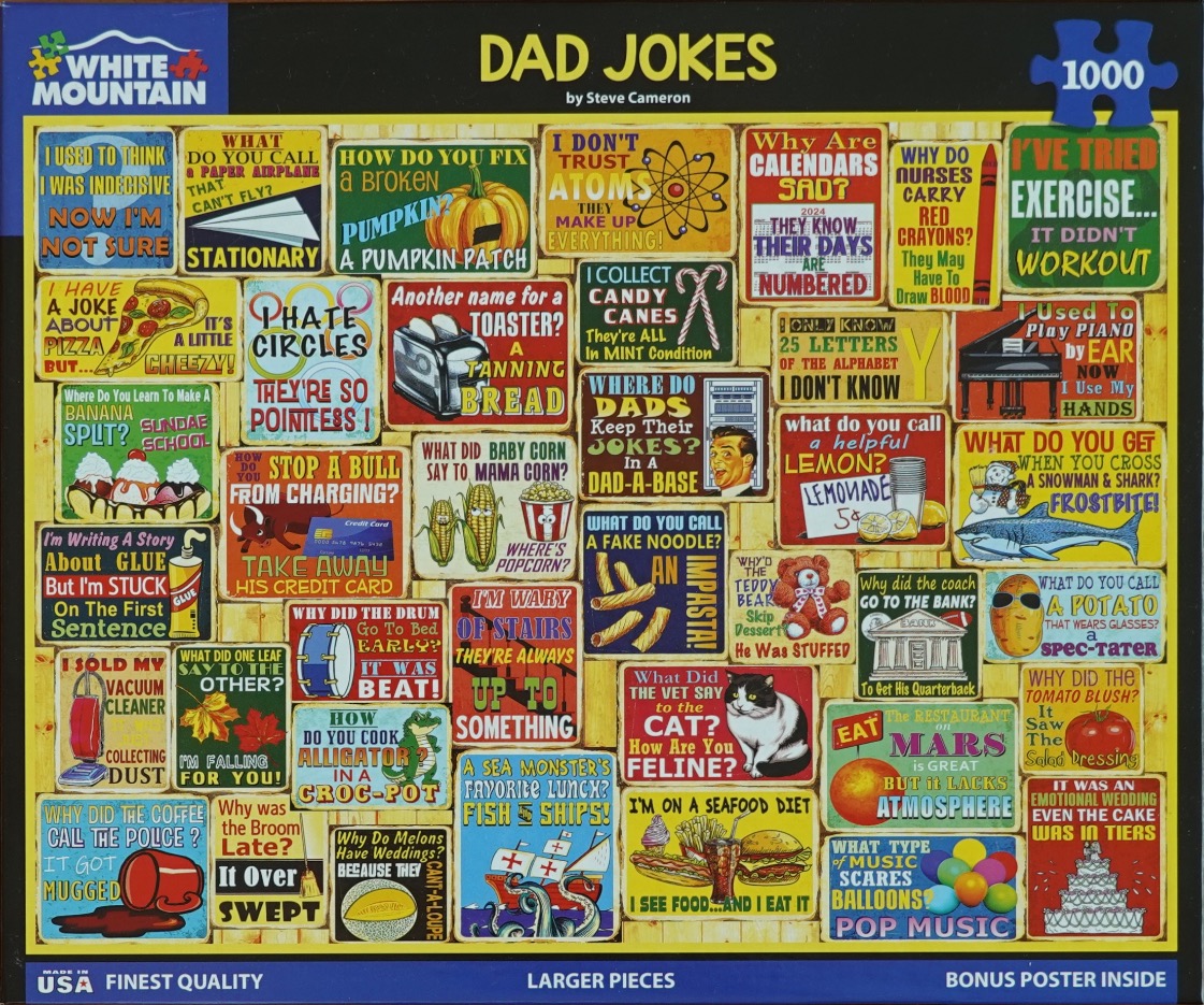
This visual features a collage of small, rectangular signs each displaying a different classic "dad joke" accompanied by thematic illustrations. The signs are packed closely together in a grid-like arrangement, creating a colorful and busy display. The jokes cover a wide range of topics, including wordplay about food, school, inanimate objects, and various puns. Each sign is styled like a vintage-inspired or novelty wall plaque, with contrasting fonts, vibrant colors, and whimsical drawings that illustrate the punchline of each joke.
Some of the specific imagery featured in the jokes includes a paper airplane, a sliced pumpkin, a slice of pizza, a toaster, candy canes, corn, and a snowman. The colors are varied and bright, using a palette of yellows, reds, greens, and blues to ensure each sign stands out. The overall composition is dense, with text and graphics competing for space, reminiscent of a bulletin board or a collection of signs in a rustic diner.
The artwork style is illustrative and cartoonish, using clean lines and bold typography to make the jokes easily readable. The variety in font styles—from classic serifs to playful, handwritten-style scripts—adds to the eclectic, humorous aesthetic of the piece. The background is a stark, solid black, which frames the colorful collage and allows the individual joke signs to pop, creating a clear visual distinction between the lighthearted content and the bold, dark borders.
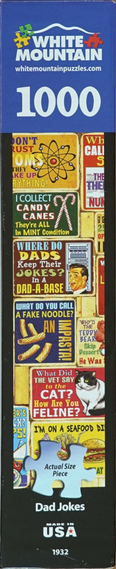
This visual features a vertical collage of rectangular metal signs, each displaying a humorous pun or classic dad joke accompanied by thematic illustrations. The signs are layered together in a rustic, cluttered arrangement, creating a colorful and nostalgic aesthetic. Each sign uses varied typography, contrasting colors, and retro-style clip art to convey its punchline.
Specific examples include a sign about atoms with a yellow atomic diagram, another featuring a candy cane with text about mint condition, and one depicting a man laughing near a server rack under the heading "Dad-a-base." Further down, there is a sign showing pasta pieces with the pun "Impasta," a red sign with a cat questioning its health, and a yellow sign referencing a seafood diet. The lighting appears soft, mimicking the reflective, slightly weathered surface of painted tin or aluminum signs.
The composition is dense and tightly packed, filling the entire vertical frame. A single, distinctively shaped puzzle piece graphic is superimposed near the bottom center, partially obscuring the "Seafood Diet" sign, with the text "Actual Size Piece" printed on it. The overall mood is lighthearted, playful, and focused on wholesome, classic humor, reminiscent of garage or man-cave wall decor.

The main artwork is a dense, colourful collage composed of dozens of small, square panels. Each individual panel features a lighthearted "dad joke" printed in bold text, accompanied by a vibrant, cartoon-style illustration that relates to the punchline. The imagery includes a variety of whimsical subjects, such as animals, food items like pumpkins and popcorn, household objects like toasters, and playful puns depicted through bright, saturated colours.
The composition is highly structured, with the squares organized in a grid-like fashion that covers the left side of the scene. The overall style is reminiscent of a comic strip or a collection of greeting card designs, utilizing a friendly, approachable aesthetic. The diverse range of illustrations—varying from simple line art to more detailed, shaded cartoons—creates a busy, engaging visual mosaic that highlights the humorous nature of the subject matter.
The colour palette is intentionally bold and varied, with each square using a distinct background colour to ensure the individual jokes stand out from one another. This creates a rainbow-like effect across the surface, drawing the eye across the many small details. The text is crisp and easy to read, maintaining a consistent graphic design style that prioritizes clarity and humor throughout the entire collection of visual gags.
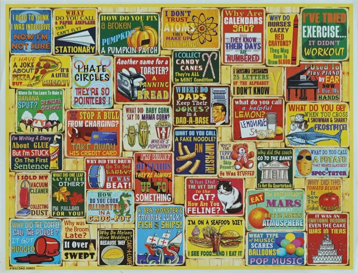
This image presents a dense, grid-like arrangement of numerous rectangular signs, each featuring a different pun, joke, or whimsical illustration. The background appears to be a light-colored, rustic wooden surface. The signs vary in color, ranging from vibrant primary hues to more muted tones, and each is framed in a style reminiscent of vintage tin plaques or retro advertising boards. The overall composition is packed, creating a playful, energetic atmosphere filled with wordplay.
Individual signs depict a wide variety of subjects, including food items like pizza, corn, lemonade, and burgers, as well as animals like cats, sharks, and alligators. Other notable illustrations include musical instruments, inanimate objects like a toaster and a vacuum cleaner, and scientific icons like an atom. Each sign combines bold, colorful typography with specific graphic elements to deliver its comedic punchline. The layout is somewhat irregular, with signs overlapping and shifting in size to fill the frame completely, ensuring there is no empty space. The variety of themes, ranging from school-related humor to silly riddles, gives the collection a lighthearted and nostalgic feel.
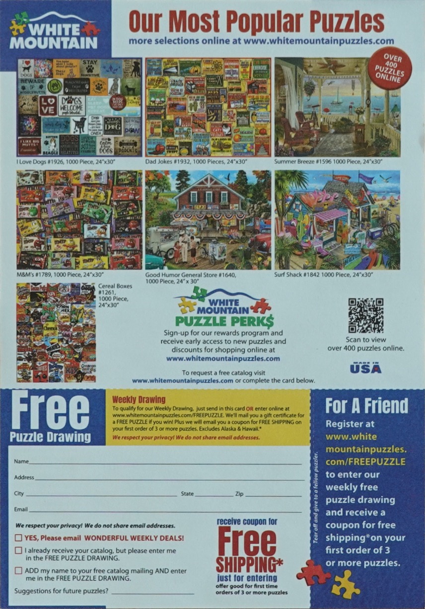
The upper section of this document showcases a collection of seven distinct, illustrative scenes arranged in a grid. The imagery includes a collage of dog-themed art, a display of dad-joke signs, a tranquil view from a porch overlooking the sea, a jumbled arrangement of candy-coated chocolate packaging, a nostalgic general store scene with an ice cream truck, a vibrant beachside surf shack, and a dense pile of classic cereal boxes. Each individual scene is rich in detail, utilizing a bright and varied color palette that suggests a nostalgic or whimsical mood.
The layout is structured into two main areas. The top two-thirds contain the visual gallery of the scenes, each accompanied by a short title and reference number. Below the images, the lower third of the document transitions into a functional form. This area features white space with lined fields for personal contact information, alongside checkboxes for newsletter and mailing list subscriptions. The bottom right section contains promotional text highlighted with bold headings about a recurring drawing, all set against a professional, clean background that utilizes navy blue and white branding colors.
The image displays a rectangular promotional flyer centered on a smooth, medium-brown wood grain surface. The flyer is positioned vertically and features a collage of colorful imagery set against a clean, white background. The composition is structured as a marketing document, with a title at the top, followed by a grid of smaller vignettes depicting various puzzle themes, including retro cereal boxes, scenic landscapes, and urban street scenes. Text elements provide product information, pricing, and promotional calls to action, organized in a clear, readable layout.
The lower portion of the flyer transitions into a functional layout reminiscent of a business reply mail envelope, complete with postal markings, address information, and a space for mailing. The color palette is bright and varied, derived from the imagery of the puzzles themselves, which contrast sharply against the neutral white backdrop of the document. The overall mood is professional and commercial, intended to inform and entice potential customers with a visual catalog of available designs and purchasing options. The photograph is taken from directly above, emphasizing the flat, paper-based nature of the material resting on the natural timber surface.