Mixed Nuts
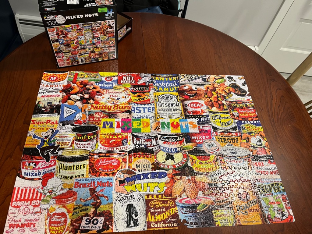
This image presents a vibrant, busy collage featuring an array of vintage-style advertisements and product labels for various nut, snack, and peanut brands. The composition is densely packed, with dozens of overlapping or adjacent rectangular and circular labels creating a patchwork effect. The center of the collection is highlighted by the words "MIXED NUTS" displayed in large, colorful block letters that sit atop the varying brand imagery.
Each section of the collage showcases distinct graphic styles from the mid-20th century, ranging from bold, typographic-heavy labels to whimsical cartoon mascots, animals, and rustic illustrations of peanuts and almonds. The palette is rich and saturated, dominated by warm tones like deep reds, oranges, yellows, and browns, interspersed with crisp whites and touches of blue and green. The overall effect is nostalgic and commercial, reminiscent of old grocery store advertising and classic tin packaging.
Technically, the image functions as a chaotic yet organized mosaic of commercial art. There is no single focal point; instead, the eye is invited to roam across the various brand names and illustrations, discovering different mascot characters, stylized fonts, and retro product claims. The style is illustrative and painterly, capturing the specific aesthetic of vintage food packaging design from a bygone era.
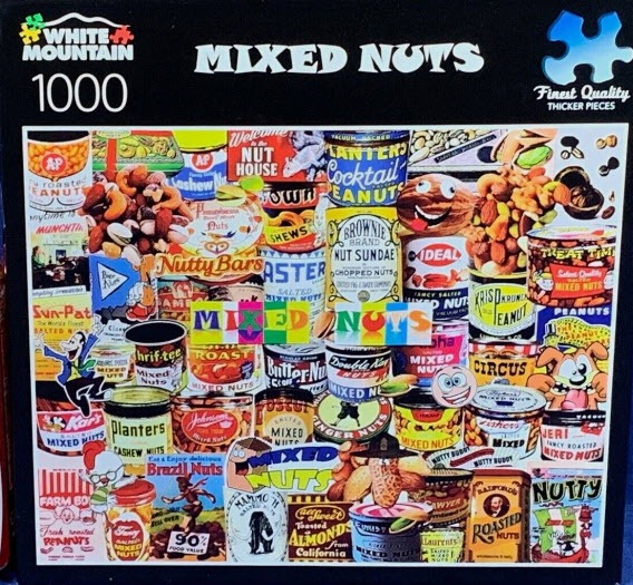
This vibrant collage displays a densely packed collection of vintage-style product cans and advertising labels themed around nuts. The composition is filled from edge to edge with colorful cylinders and rectangular advertisements, overlapping in a whimsical, mosaic-like arrangement. The imagery includes a wide variety of graphic styles, ranging from classic mid-century typography and bold brand logos to playful cartoon characters and illustrations of assorted peanuts, cashews, and almonds.
The overall aesthetic is retro and nostalgic, featuring a palette dominated by warm earth tones like tan, brown, and ochre, contrasted against bright pops of red, blue, and yellow from the various labels. Each individual can or advertisement offers a unique visual, with some featuring prominent anthropomorphic nut characters, while others rely on bold serif lettering and realistic depictions of their contents. The light is flat and even, characteristic of an illustrative print, creating a busy yet harmonious graphic design.
Secondary details include scattered loose nuts tucked into the small crevices between the cans and a central, colorful text overlay that reads "MIXED NUTS" in block letters. The variety of designs suggests a collection of historical ephemera, with some labels appearing worn or weathered, contributing to an overall busy and lighthearted mood that celebrates food packaging history.
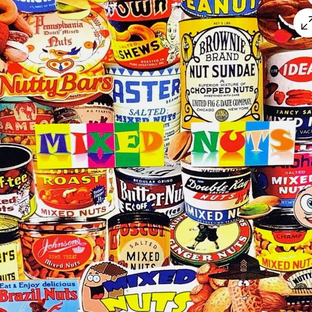
A dense, overlapping collage of vintage nut product packaging creates a vibrant, busy scene filled with retro graphic design. The composition is packed with various tin cans and labels, each featuring distinct typography, illustrative mascots, and color palettes ranging from bold yellows and reds to deep blues. A prominent, stylized banner reading "MIXED NUTS" sits horizontally across the center, layered over the cans in vibrant, blocky letters.
The overall mood is nostalgic and energetic, reminiscent of mid-century advertising art. The lighting is bright and even, highlighting the textured details of the illustrations, such as anthropomorphic peanuts, vintage figures, and intricate ornate lettering. The chaotic layering of circular and cylindrical shapes creates a sense of depth and visual rhythm, pulling the eye across the multitude of brand marks and decorative patterns. Each section of the scene contributes to a cluttered, quilt-like aesthetic where no empty space remains, celebrating the history of commercial food packaging.