The Rolling Stones - Some Girls
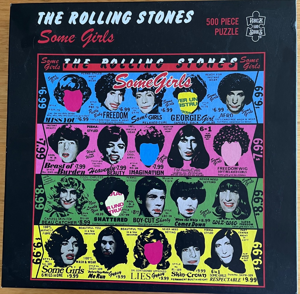
The main artwork is a stylized grid reminiscent of a vintage beauty supply advertisement or catalogue from the 1970s. The design is split into four horizontal colored bands—blue, pink, green, and yellow—each containing a series of black-and-white portraits of celebrities wearing various wigs. Each portrait is overlaid with text such as style numbers and catchy names, while several faces have their features obscured by bold, solid-colored patches in hues of bright pink, blue, yellow, and green.
The layout follows a structured, graphic design style, with the band colors creating a vibrant, segmented background for the monochromatic images. Text is scattered throughout each section, mimicking the look of advertising copy with phrases like "100% Wash & Wear" and various prices ranging from $6.99 to $9.99. The typography varies in size and style, ranging from bold sans-serif headings to smaller, instructional-looking print.
The overall aesthetic is a pastiche of pop art and mid-century commercial design. The contrast between the stark black-and-white photography of the faces and the flat, saturated colors of the background bands and facial cut-outs gives the work a subversive, collage-like quality. The arrangement feels deliberately chaotic and commercial, mimicking the chaotic nature of vintage wig advertisements.
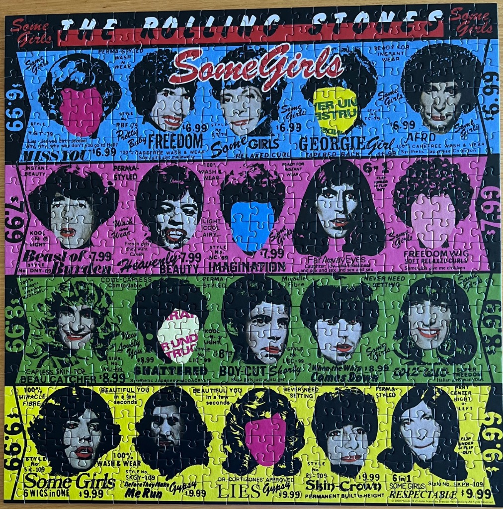
The image is a stylized, colourful collage resembling a vintage wig catalogue or advertisement. It features twenty individual portraits arranged in a grid across four horizontal bands of differing colours: blue, magenta, green, and yellow. Each portrait displays a person with dark hair styled in various wig designs. In several of the portraits, the face is partially or entirely obscured by brightly coloured blocks—specifically hot pink, vibrant yellow, or bright blue—or by text, creating a pop-art effect.
The layout is densely packed with graphic design elements, including retro-style typography, pricing labels, and descriptive text related to hair styling. The top of the composition is dominated by the band name, "THE ROLLING STONES," printed in large white lettering, while the title "Some Girls" appears in a script font. The vertical edges of the image contain recurring price tags like "$6.99" and "$9.99," reinforcing the catalogue aesthetic.
The colour palette is intentionally high-contrast and saturated, using primary and secondary colours to segment the grid. The lighting in the portraits themselves is consistent with black-and-white photography, which contrasts sharply against the bold, flat blocks of solid colour that overlay the faces. The overall mood is edgy, satirical, and reminiscent of 1970s graphic design and punk-rock visual sensibilities.