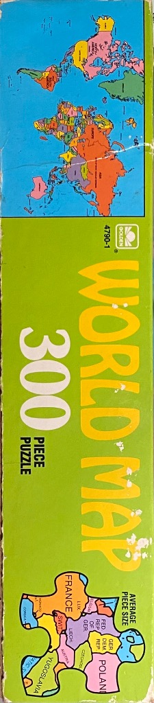
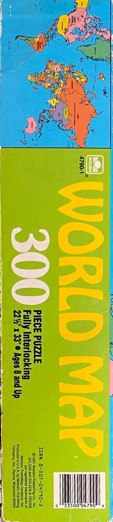
World Map
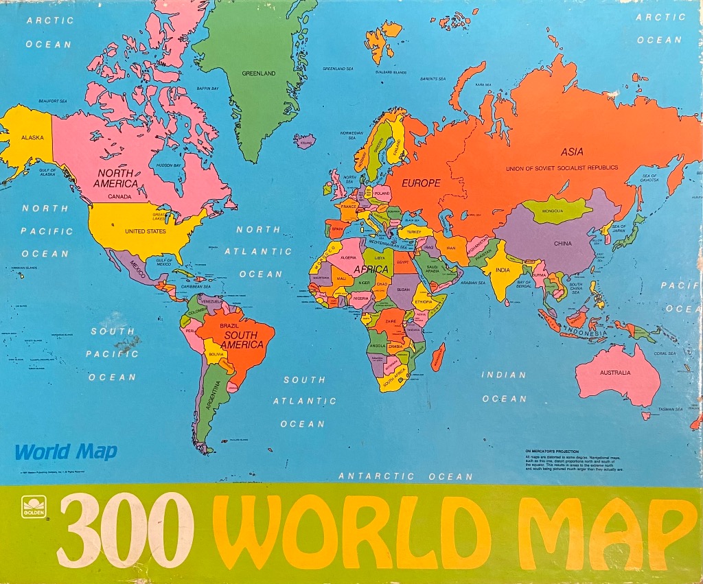
This vintage-style political map of the world presents a Mercator projection that fills the majority of the field. The landmasses are divided into distinct nations, each color-coded with a variety of bold, flat primary and secondary colors, including pink, yellow, orange, purple, and green. Labels for continents, countries, major bodies of water, and oceans are printed in a clean, sans-serif font across the surface.
The oceans are depicted in a solid, light blue color, providing a strong contrast to the colorful landmasses. The overall composition is symmetrical and clear, functioning as an educational reference chart. Notable geographical features such as the Arctic, Pacific, Atlantic, and Indian Oceans are clearly marked, while smaller seas and geographic regions are labelled in smaller, finer text.
The aesthetic is reminiscent of an educational mid-century school map. At the bottom, there is a lime-green horizontal banner containing the words "300 WORLD MAP" in large, bold, yellow-orange lettering. Small, precise text in the lower-right corner offers a note about the Mercator projection, explaining the distortion inherent in this specific cartographic style.