Canadian Flag Made of Flowers
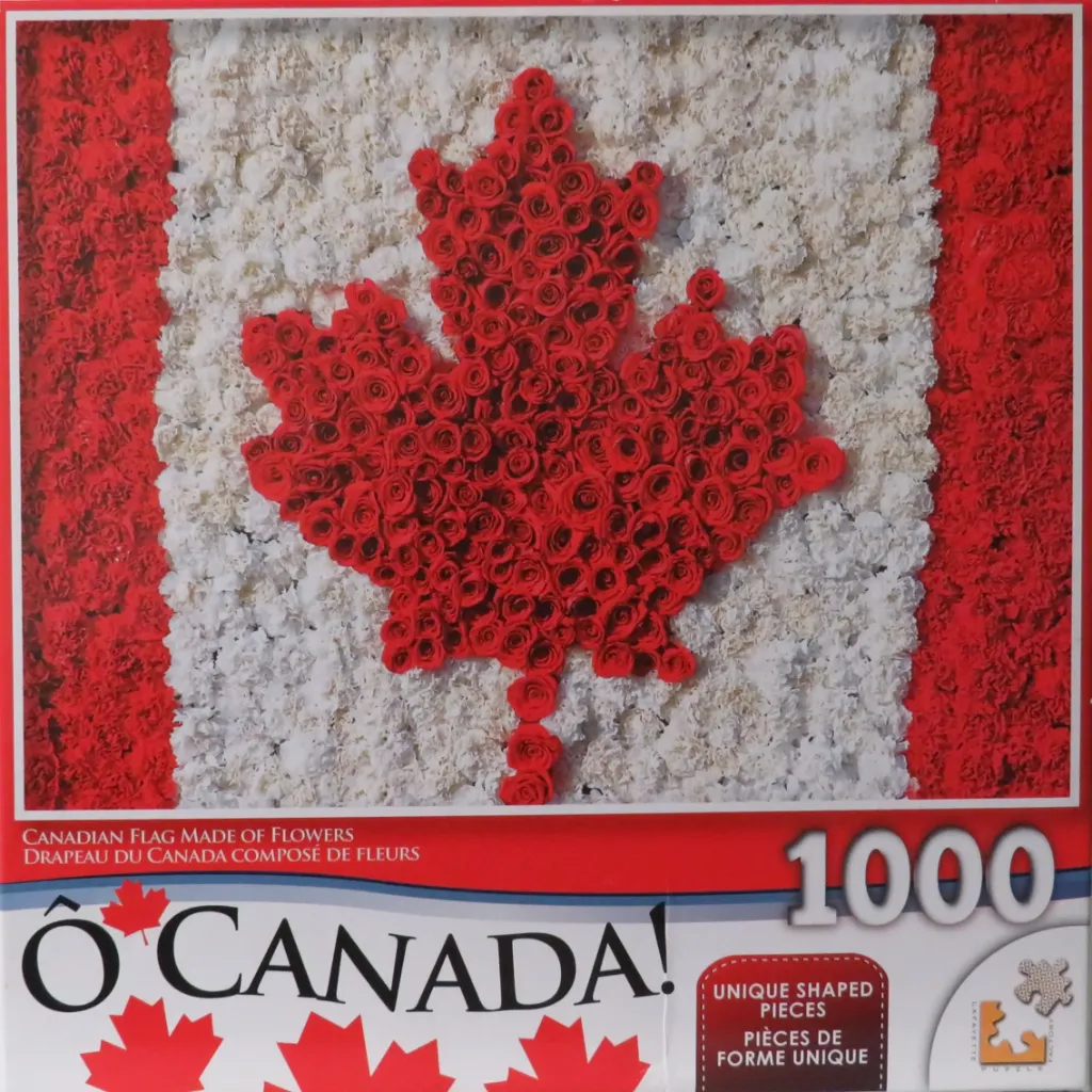
This photographic image displays the Canadian flag recreated entirely through a dense mosaic of flowers. A central maple leaf shape is constructed from dozens of vivid red roses, their tightly packed petals creating a rich, deep texture. This central icon stands out prominently against a background of white flowers that form the central pale panel of the flag design.
On either side of the white field, two vertical columns are composed of numerous small, ruffled red blooms, likely carnations, which mimic the red side panels of the national banner. The perspective is a flat, head-on view that emphasizes the floral construction, giving the flag a soft, organic, and highly textured appearance rather than a flat fabric texture.
The colour palette is strictly limited to the iconic red and white of the national flag, creating a high-contrast and patriotic visual. The lighting is soft and even, highlighting the individual petals and the slight variations in tone within the clusters of flowers. The overall effect is sculptural, transforming a familiar national symbol into a complex, nature-inspired display.
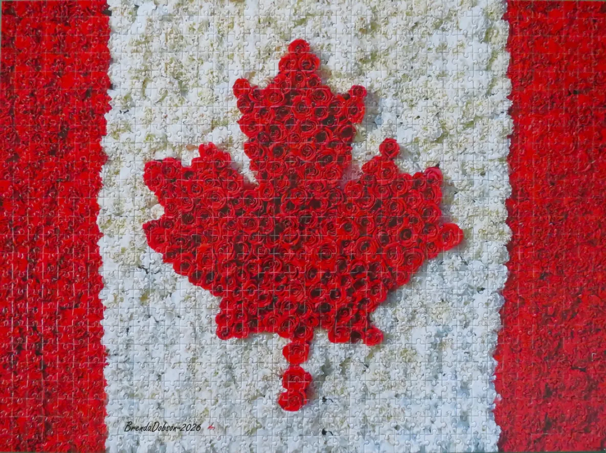
This image features a vibrant, floral recreation of the Canadian flag. The design is structured in the traditional format, with two thick vertical stripes of deep red on the left and right sides, flanking a wider central white panel. At the very center of the white section sits a prominent maple leaf shape, rendered in a matching shade of intense red, creating a striking contrast against the pale background.
Every element of the flag is meticulously crafted from masses of individual blossoms. The red sections, including the central maple leaf, are composed of tightly packed red roses, showing rich gradients of crimson, scarlet, and deep maroon. The white central background consists of a dense field of small, textured white flowers, perhaps carnations or mums, which provide a soft, creamy contrast to the bold red of the roses.
The overall composition is clean and symmetrical, mimicking the precise geometry of a national flag through organic, floral textures. The lighting is even and bright, highlighting the intricate petal details of each flower and adding a sense of depth to the arrangement. In the lower-left corner of the white field, the text "BrendaDobson-2026" is written in a simple, dark script.
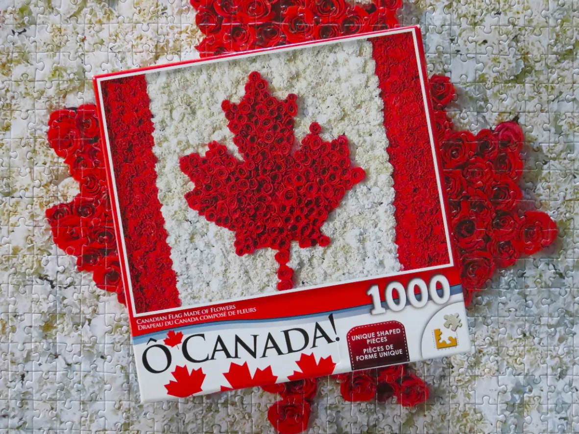
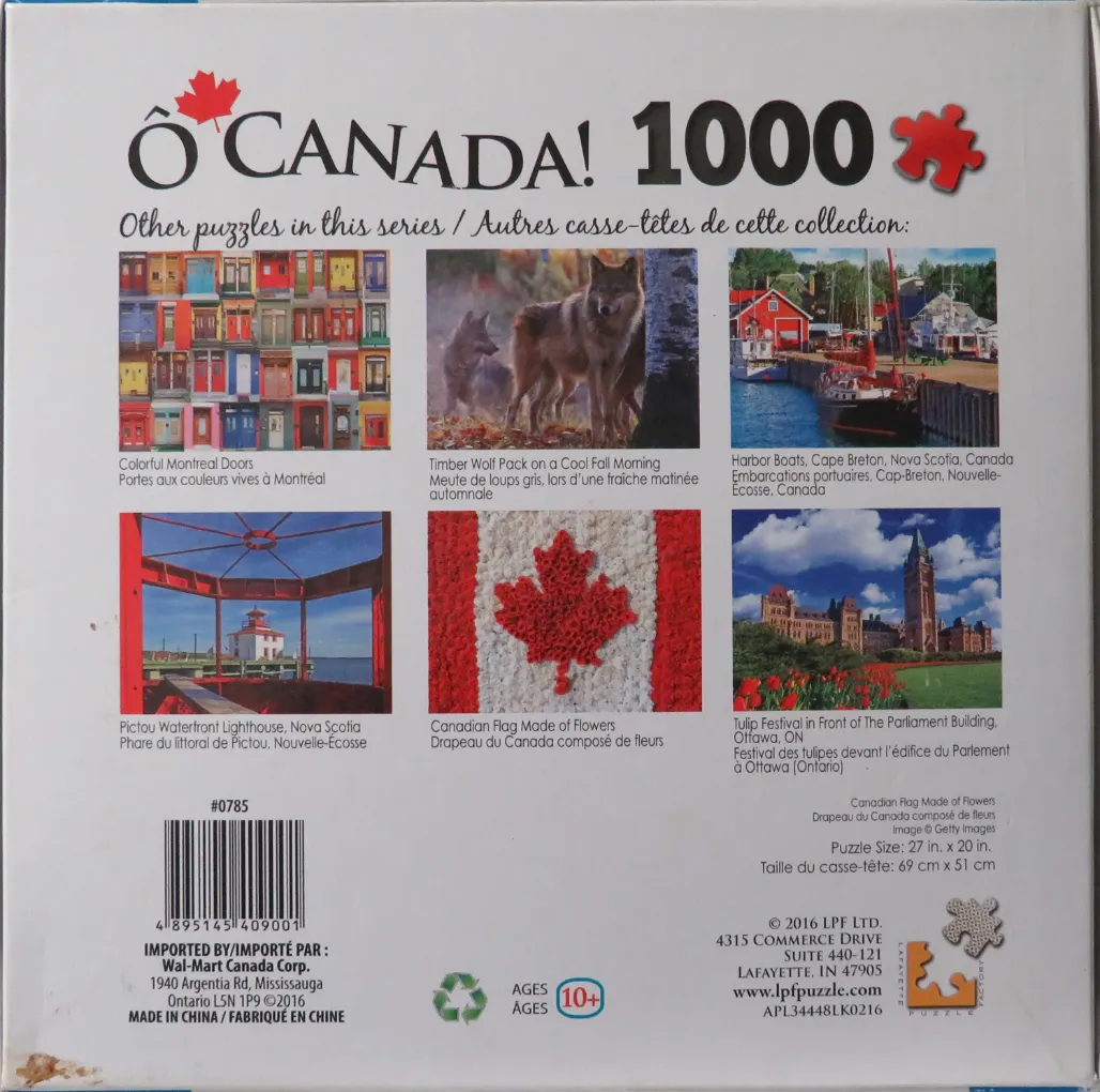
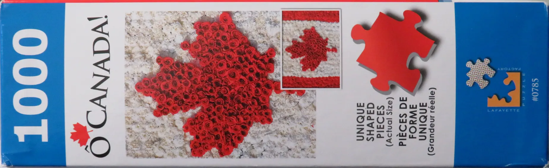
We were so glad all the pieces were there (this was a thrift store purchase) as this was definitely a challenging puzzle but also enjoyable. After the border was done, we did the outline of the maple leaf and the lines dividing the red from the white. Once that was done it was on to the white flowers (carnations) which we figured would be easier than the red flowers (carnations on the right and left and roses for the flag). We were right.......the red flowers took about 3 times as long as the white flowers. Some pieces were easy to find by a great number of them were a matter of trying piece by piece.
by Brenda Dobson 2026-05-14