Wacky Packages
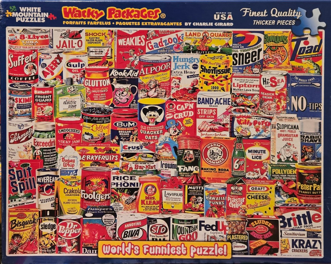
This collage features a dense collection of satirical product labels and household brand parodies, rendered in a colorful, illustrative style reminiscent of vintage grocery packaging. The composition is packed wall-to-wall with tin cans, boxes, and bottles, each displaying humorous, pun-filled alterations of real-world food and household goods. These include items like 'Sufferin Coffee,' 'Alpoor Dog Food,' 'Band-Ache Strips,' and 'Slopicana Orange Juice.'
The image is a riot of bold, saturated primary and secondary colors, with red, yellow, and blue backgrounds dominating the individual items to create a high-energy visual experience. The lighting is uniform, as if seen under bright, flat retail shop lights, which emphasizes the clean lines and graphic text typical of 20th-century commercial art and comic book aesthetics.
Throughout the scene, small, whimsical character designs and exaggerated faces are integrated into the product labels, adding to the humorous and slightly chaotic atmosphere. The lack of open space creates a sense of overwhelming variety, with every inch filled by distinctive typography, whimsical illustrations, and bizarre brand names that mock consumer culture.

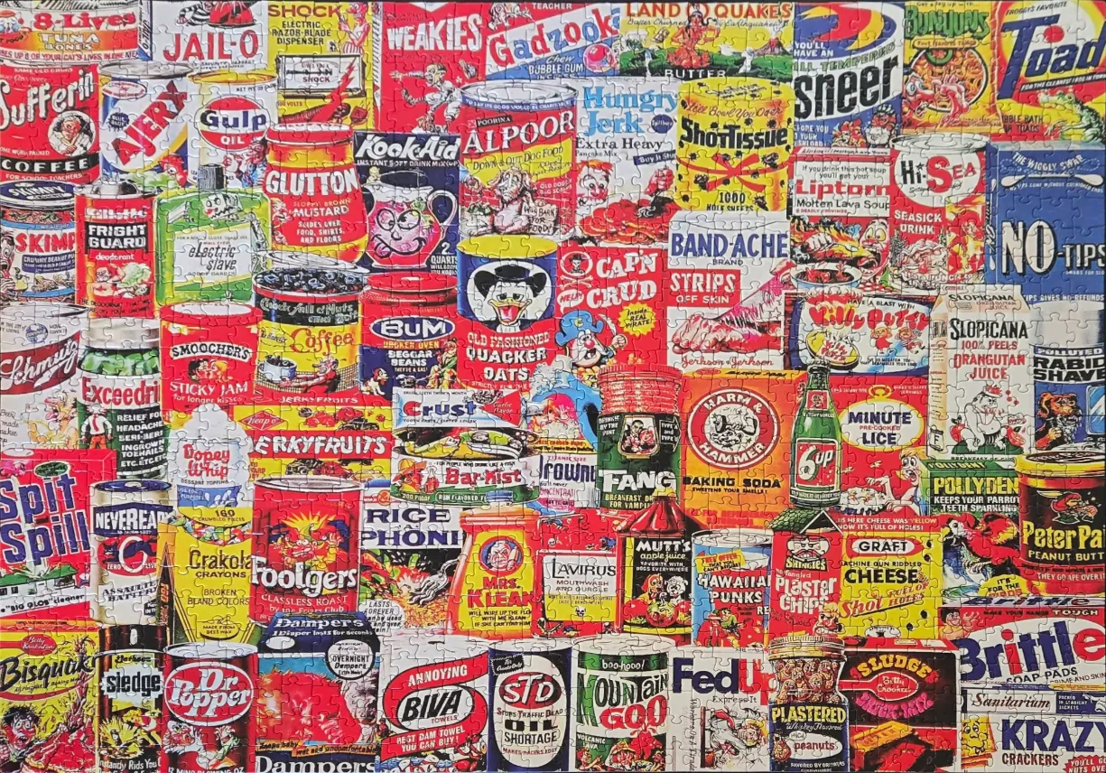
This busy illustration presents a chaotic, densely packed collection of parodied product labels, tin cans, and boxes. The image is an accumulation of surreal and humorous branding, featuring names like "Alpoor" dog food, "Capn Crud," "Minute Lice," and "Gulp Oil." Each item is rendered in a graphic, cartoon-like style reminiscent of mid-century commercial advertising, with exaggerated characters, bold typography, and absurd product descriptions that replace traditional household item labels.
The layout is a crowded grid where products are stacked and layered without a clear background or horizon line. This creates a cluttered, maximalist effect where every inch of the visual space is occupied by competing advertisements and colorful containers. The composition lacks a single focal point, forcing the eye to wander across the surface to read the various witty and irreverent product names that spoof familiar consumer goods.
The color palette is vibrant and saturated, dominated by primary colors—bright reds, yellows, and blues—punctuated by stark white and deep black text. The lighting is flat and uniform, typical of commercial illustration, which emphasizes the clean outlines and bold shapes of each product. The overall mood is playful, satirical, and frantic, designed to evoke the aesthetic of kitschy, vintage grocery store shelves while mocking the relentless nature of branding and consumer culture.
Interstitial spaces between items was challenging
by Jim Poleshuk 2026-05-29