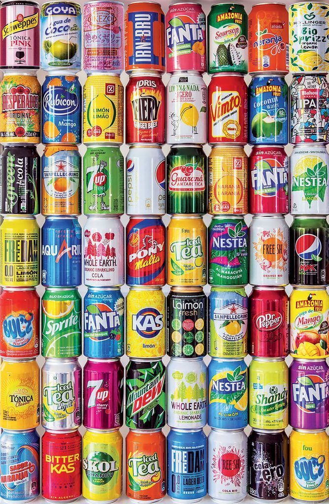
This image displays a highly organized, dense grid of aluminum beverage cans, arranged in eight rows and eight columns. The composition is uniform, filling the entire frame with a vibrant mosaic of colors and branding. Each can occupies a consistent space, creating a repetitive and systematic visual pattern that emphasizes the variety of designs, color palettes, and typography used in commercial beverage packaging.
Individual cans showcase a wide spectrum of hues, ranging from bold reds and oranges to cool blues, vibrant greens, and sunny yellows. Some labels feature minimalist graphics, while others are cluttered with complex illustrations, fruits, and stylized logos. The arrangement creates a rhythmic texture, with the metallic reflections on the cans catching the light to provide a glossy, uniform finish across the entire assembly.
The overall mood is energetic and commercial, reflecting a broad spectrum of global refreshments. The layout is strictly grid-based, providing a sense of order despite the visual chaos of competing logos and marketing designs. The lighting is bright and even, highlighting the rounded forms of the cylinders as they press against one another, forming a tightly packed, colorful wall of individual drink containers.