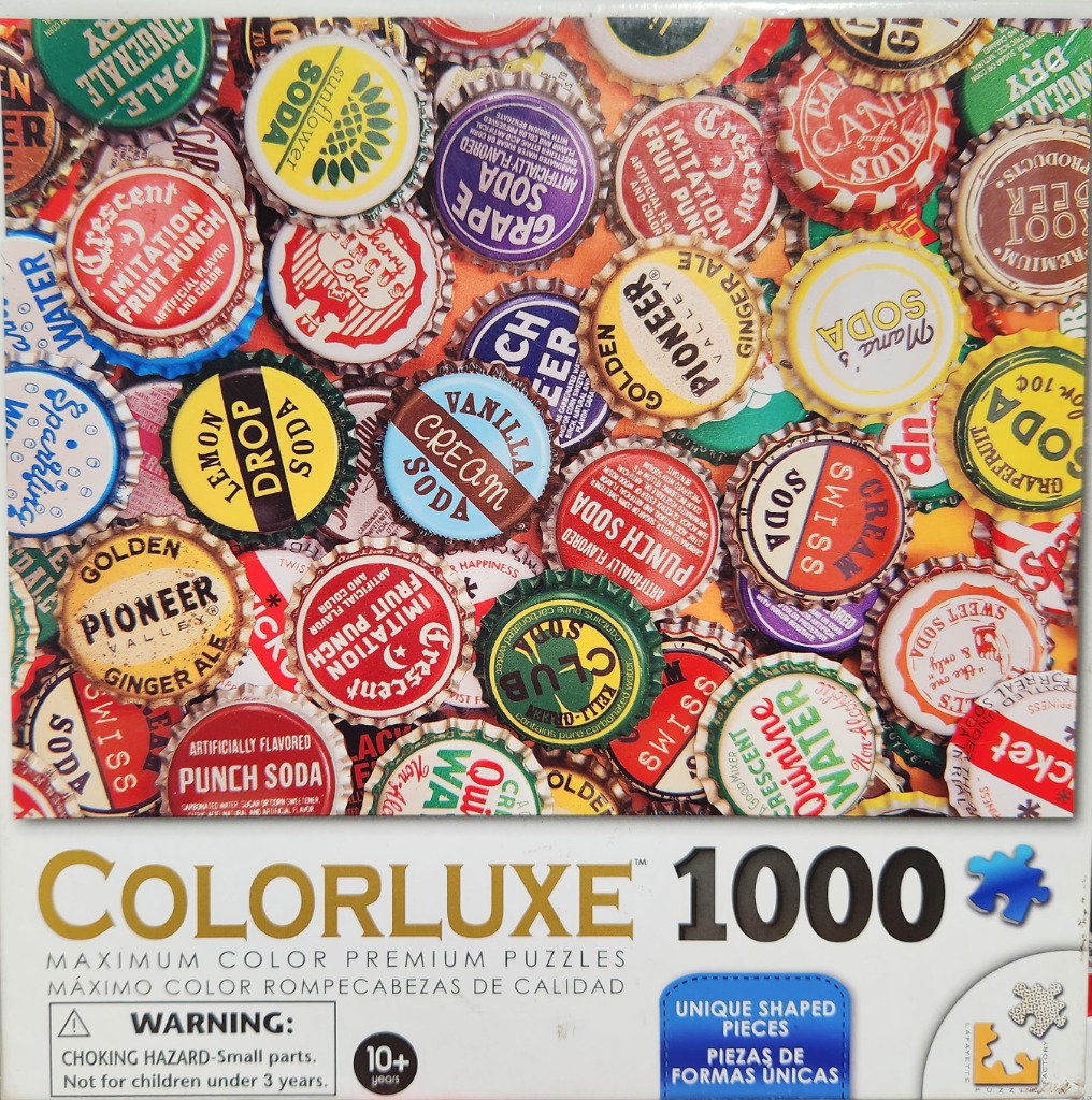
This image features a dense, overhead collage of vintage metal bottle caps. The caps are layered in a chaotic, overlapping pattern that fills the entire frame. Each cap showcases unique typography, vintage logo designs, and distinct brand names such as Pioneer Valley, Crescent, and Swiss Soda. The caps are depicted in a realistic, slightly weathered style, capturing the serrated edges and the crinkled metal textures typical of historical drink packaging.
The composition is high-energy and packed with detail, utilizing the varying sizes and overlapping angles to create a sense of depth and abundance. No background is visible; the scene is entirely composed of these rounded metal discs. The layout emphasizes the variety of designs, from bold, solid-colored backgrounds in red, yellow, green, and blue to intricate text-heavy labels.
The colour palette is vibrant and nostalgic, dominated by primary and secondary hues that pop against one another. The lighting appears soft and uniform, which helps to flatten the overall image while maintaining the tactile quality of the metal surfaces. The aesthetic is reminiscent of mid-20th-century graphic design and advertising, emphasizing retro fonts and playful, punchy branding elements. The overall mood is cheerful, bright, and collectable.