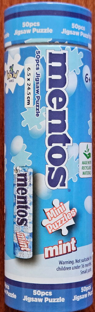
The visual design features a vibrant, light-blue background filled with a scattered pattern of white jigsaw puzzle pieces and soft, glowing circular orbs. The central focus is the word "mentos" written in a large, bold, dark-blue sans-serif font, oriented vertically along the center of the cylindrical surface. Below this, a white jigsaw puzzle piece shape contains the words "Mini Puzzles" in a playful, reddish-orange font, with the word "mint" positioned directly underneath in a similar bold, orange-toned typeface.
To the left of the main text, a smaller vertical graphic shows a stylized, partially assembled image of a classic roll of mint candies rendered as a jigsaw puzzle. The composition is clean and modern, utilizing a cool color palette dominated by various shades of blue, punctuated by bright white accents and pops of warm orange. The overall style is reminiscent of commercial graphic design, combining product branding with playful, casual imagery.
Various informational text and icons are interspersed throughout, including a "6+" age recommendation, a leaf-shaped logo representing recyclable materials, and small rectangular labels indicating size specifications. The top and bottom of the cylinder are bordered by darker blue bands, framing the lively, puzzle-themed design elements.