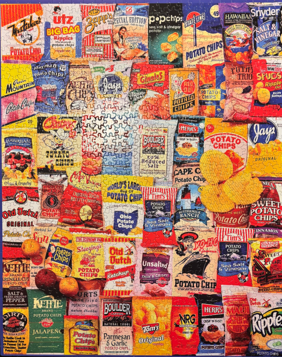
This image displays a dense, overlapping collage featuring an assortment of potato chip bags from various brands. The collection is arranged in a grid-like pattern, creating a vibrant tapestry of graphic design, typography, and food illustration. Each individual bag showcases distinct branding, ranging from retro, nostalgic logos to more contemporary, bold designs. The visual field is completely filled with these snack packages, creating a sense of abundance and variety.
The colour palette is exceptionally bright and saturated, drawing from the primary and secondary colours used on the packaging—vibrant reds, deep blues, sunny yellows, and forest greens. Lighting across the composition is flat and even, highlighting the diverse textures of the bag materials and the variety of fonts used for the brand names and product descriptors. Several loose, individual potato chips are scattered over the right side of the collage, providing a small visual break in the dense grid.
The style is graphic and commercial, mimicking the aesthetic of a supermarket snack aisle. Some bags feature illustrated mascots, iconic landmarks like lighthouses or ocean liners, and artistic renderings of the potatoes themselves. The composition is deliberately crowded, with no negative space, inviting the viewer to scan each package to identify unique details, flavors, and historical branding elements.